Without the Bite, Would Apple Be Apple?
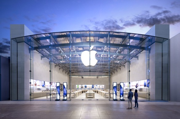
Apple has a unique brand: The iconic Apple logo identifies “Apple” with just a symbol, and it’s so synonymous with Apple and its products that the symbol does all the work. You see the Apple image with the wicked cool bite and you know immediately that it represents an Apple product or the company itself. It takes a lot of work to create this brand, of course, and Apple stands at the top of the mountain with its success.
Few other companies come close. Nike, with its Swoosh symbol comes to mind. But there’s still a leap of association from the Swoosh to Nike — the Swoosh is not a thing with a name that matches the name of the company. How about Target, then? Pretty good. The red Target symbol is also a Target. The only difference between Target and Apple here is that Apple has global reach and is a massively larger brand.
Except, there’s more to it than that, and just one little detail is the key: Target is red and white, but outside of the those who are familiar with Target the store, the target logo is just a target. Apple, though, has that jaunty bite. The overall apple shape drives the association to the word apple, and the bite creates the specific association with Apple, the company and the products. Without that bite, Apple is just a banana, orange, or kiwi. A basic brand name associated with a piece of fruit. But the bite?
It makes all the difference in the world.


